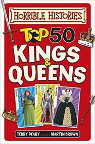
Fig 1. ‘Horrible Histories’, Scholastic Publishing, illustrated by Martin Brown
I organise the Doncaster Book Awards and had arranged for ‘Horrible Histories’ illustrator Martin Brown to speak to some 1,200 Doncaster school children at our 2018/19 launch on Thursday. On the subject of ‘heroes’, Martin is a bit of an illustration hero for me having created my own ‘horrible’ local history book. It was fantastic to have Martin enthuse the children of my home town about drawing, history and reading – and as a bonus, what he said also got me thinking about my own practice, its development and the current MA project itself.
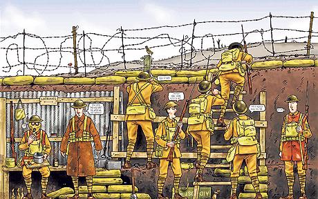
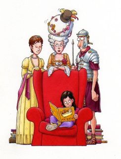
Fig 2. ‘Horrible Histories’ illustration by Martin Brown
The cartoony style of my own illustrations is not dissimilar to Martin’s, although I vastly admire the detail he includes with the costumes of his characters and often the settings that surround them. These are two aspects that I hope to improve on during my MA course. At the SCWBI conference last year, I had a one-to-one critique which recommended these as a focus for me, which I entirely agree with. I spoke to Martin about how he researches the costumes for his characters. He told me about a book he used until it fell to pieces which had illustrations for clothes through the ages, but says he now relies mainly on the Internet. He also mentioned collections and images at the V&A, which is something I plan to look into.
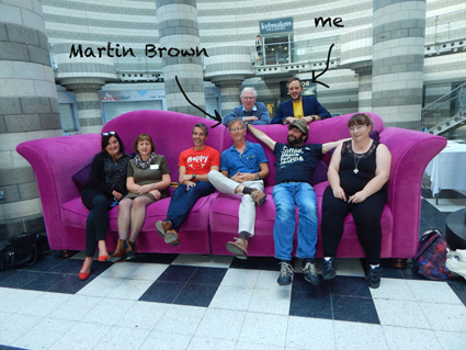
Fig. 3: Doncaster Book Awards, Doncaster Dome, Oct 2018
During his speech to the children, Martin was very keen to persuade his audience to draw, no matter what they thought of their own drawings. “By the end of this talk,” he said, “You’ll either be better at drawing… or you’ll feel better about being crap at drawing!”. He talked about realistic drawing versus ‘unrealistic’ ones. He showed his his audience what he meant in a very clear manner using images of art through history. He said, for example, that there is a lot of evidence that cave people could draw realistically – but they often chose to draw in the stylistic way shown below…
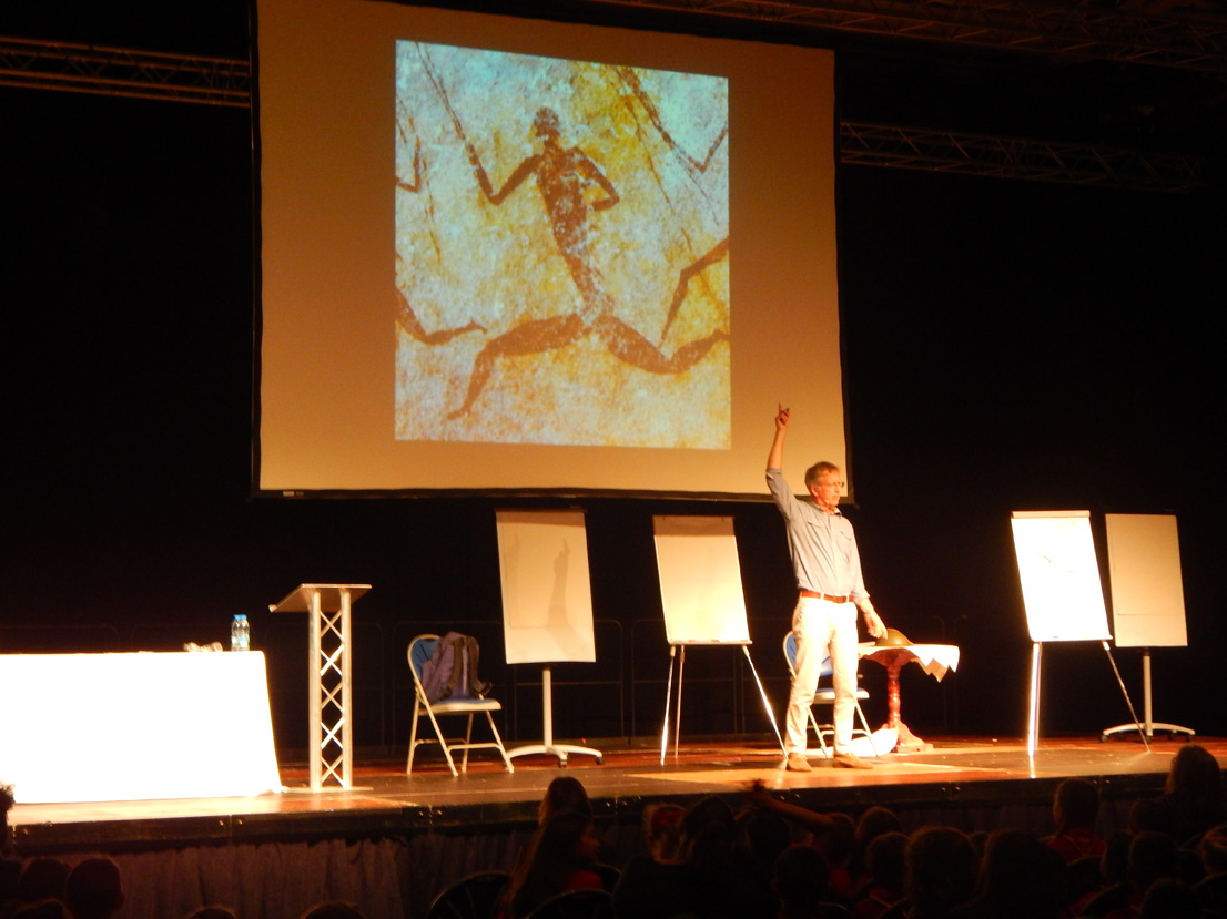
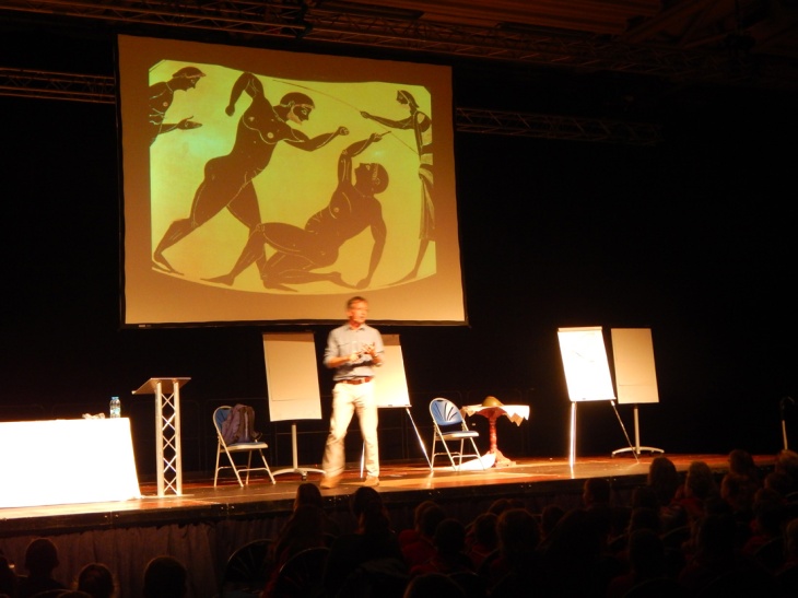
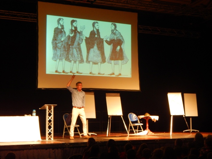
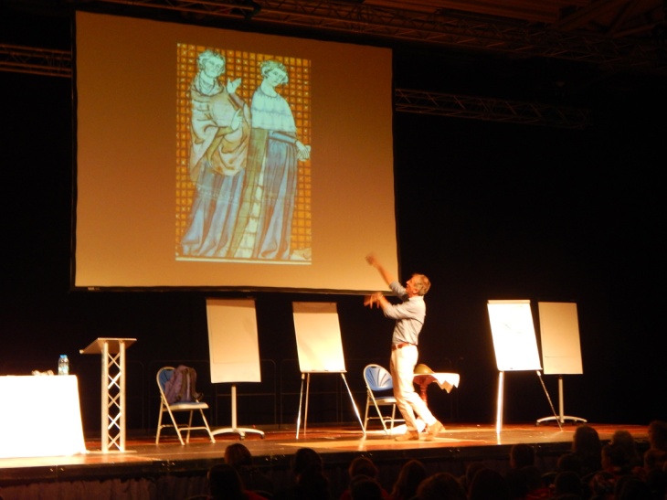
Fig. 4-7: Martin Brown at Doncaster Book Awards, Doncaster Dome, Oct 2018
Martin then took us through other examples from history to illustrate how artists chose to draw ‘unrealistically’, including the Greeks “drawing chests on backs”…
… artists in the Middle Ages drawing figures with massive hands …
… and these guys with no shoulders:
Of course, Martin’s intention was to help children believe in their ability to draw and not to worry about accuracy, whilst giving them a basic lesson in art history – but it also reminded me of the development of my own illustrations and the direction these are taking. Back at the SCBWI conference last year, I remember illustrator Alex T Smith telling us about a major breakthrough he had when he realised that he did not have to be accurate or realistic in the way his characters’ limbs moved or bent. I include an example of his work that shows this below (left). I took this advice to solve a problem when illustrating my poem ‘The Rhyme Thief’ (below, right) and plan to explore this more in my work. It is worth noting that this does not mean that detail is sacrificed in the drawings – both Alex T Smith and Martin Brown often include a lot of detail in their drawings, particularly with their clothing which, as I said earlier, I am looking at in my own practice.


Fig. 8 / 9: ‘giddy girl’ illustration by Alex T Smith and my won illustration for my poem ‘The Rhyme Thief’
Back at the Doncaster Book Award talk, Martin then took the audience through various contemporary illustrators that do not “draw realistically’. We take it for granted that an illustrator drawing a rat riding a horse would look look something like this. In real life, it would look much more bizarre than the drawing Alex Scheffler creates.
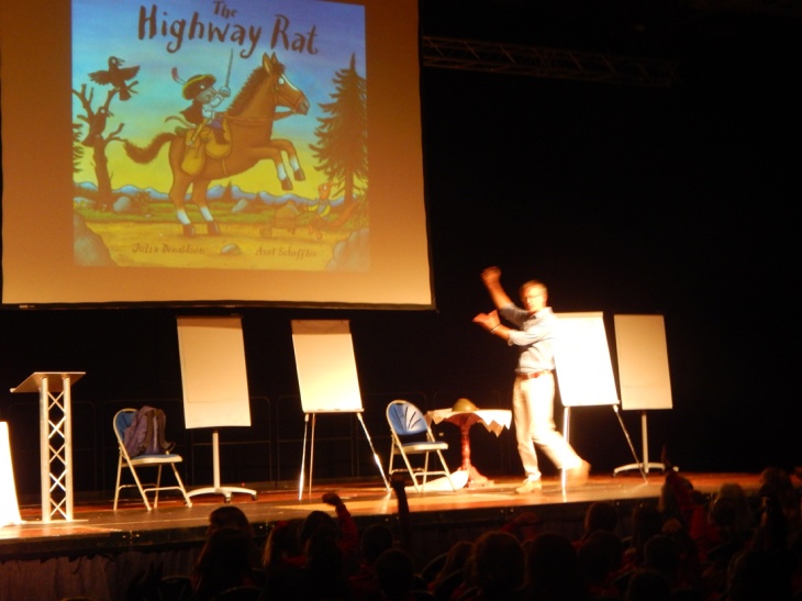
Fig. 10-12: Martin Brown at Doncaster Book Awards, Doncaster Dome, Oct 2018
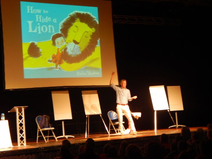
I love the way the illustrator below uses only three main colours to create this heart-warming illustration. Of course, a girl hugging a lion created realistically would have a very different effect on the viewer/reader!
Martin spoke about this illustration by Sarah McIntyre (below), an illustrator I’ve admired for some time. This made me look more closely at this particular image. I’ve created a shark character myself before to illustrate my poem ‘The Princess and the Shark’ (also below). During the critique at SCBWI, we discussed these characters of mine at length. My one-to-one tutor was complimentary about some aspects of my shark design – but now I can see how much further I could have taken it. A bit of experimentation could have made my shark much more distinctive. McIntyre’s shark here has huge yellow teeth with dirty patches, patterned skin and even a moustache. As well as making it distinctive, it’ll be really fun for the target audience. If anything, this teaches me to spend longer on character design, to be more experimental and not to stick with the first few ideas.
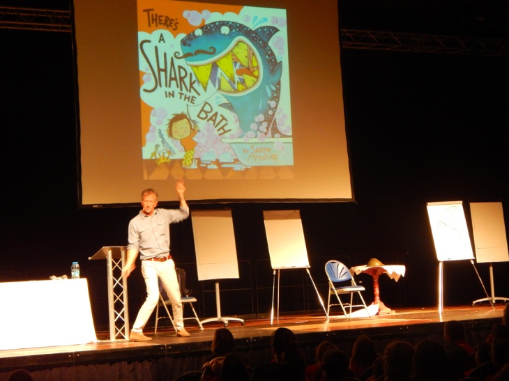
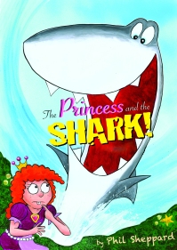
Fig. 13: The cover for my picture book, ‘The Princess and the Shark’ (self-published, 2010)
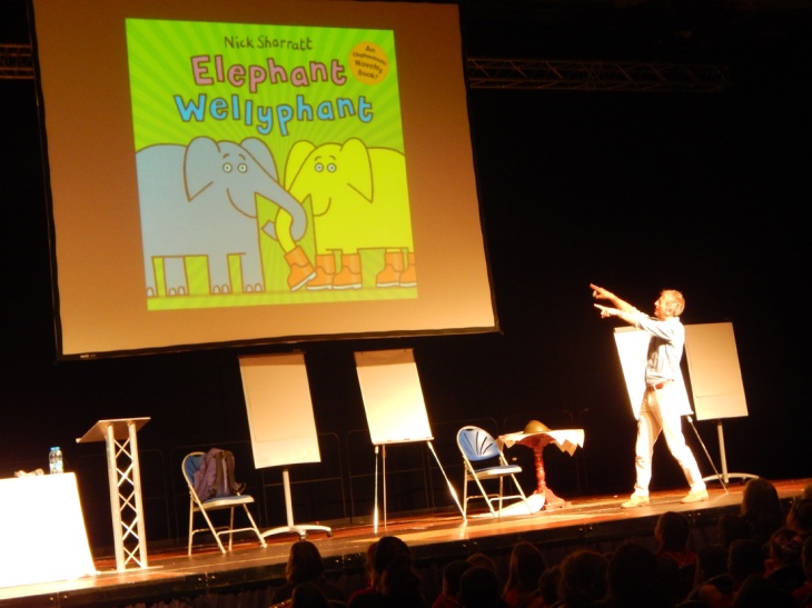
Finally, this image from Nick Sharratt shows how important it is to develop your own distinctive style and that, sometimes, simplicity if key…
Coming soon: As an interesting aside in relation to my key word “heroes”, Martin also talked about his heroes in illustration and cartooning, mentioning Bugs Bunny as a frame of reference. In a later blog, I plan to look at Warner Bros drawings in relation to movement and character design.
Image Links
Fig. 1 and Fig.2: Martin Brown, https://summerreadingchallenge.org.uk/book/12032709
Fig.8: Alex T Smith, http://alextsmith.blogspot.com/p/sketchbook.html
(other images are my own)
